UX UI Case Study
UX UI Case Study
AI Powered property tool
AI Powered property tool
AI powered property recommendation tool for tripsters.
AI powered property recommendation tool for tripsters.
Aloha
Aloha

Problem Statement
Problem Statement
How might i design the aloha app without following traditional UI yet promoting the brand's USP of ai powered recommendations for its users?
How might i design the aloha app without following traditional UI yet promoting the brand's USP of ai powered recommendations for its users?
Warwick was addressing the common problem every work-travel enthusiast faces which was to get right accommodation at the place. So far travellers had faced that airbnb proves expensive and if took local help, then property on rent comes with a predefined lock-in period. Eg: 6 months or 1 year.
Aloha! wanted to solve this problem by allowing its user to look for staycations and pay only for the days they will be using it. For property owners, it would be similar to airbnb but serving different set of users.
For me, it was Warwick's algo which has to be prioritised when designing the user experience for the app.
Our Approach
Our Approach
This Project is one of those which comes from the very scratch and requires to be dealt at all levels to get the needed output.
Using the double diamond design approach, i phased through all the below mentioned processes:
Discover
Define
Design
Deliver
While this approach looks linear but trust me, i had to go back & forth multiple times before even starting on the final user interface.
Team
Team
1 UX Designer
1 UX Designer
1 POC (Client)
1 POC (Client)
My Role
My Role
UX Research
UX Research
UX Design
UX Design
UI Design
UI Design
Interaction Design
Interaction Design
Final Adaptations
Final Adaptations
Tech Handovers
Tech Handovers
Timeline
Timeline
Overall : 8+ weeks
Overall : 8+ weeks
Discovery & Research : 2+ weeks
Discovery & Research : 2+ weeks
Design & Testing: 6 weeks
Design & Testing: 6 weeks
Design Process we followed
Design Process we followed
User Research
User Interview
User Research
User Interview
User Persona
User Journey Map
User Persona
User Journey Map
Brainstorming
User Flow
Brainstorming
User Flow
Sketch Wireframes
Visual Design
Prototype
Sketch Wireframes
Visual Design
Prototype
Check Usability
Improvements
Check Usability
Improvements
Emphatize
Emphatize
Define
Define
Ideate
Ideate
Design
Design
Test
Test
Define Phase
Define Phase
User Persona
User Persona
Fabian Allen
Fabian Allen
Age
Age
32 years old
32 years old
Status
Status
Single
Single
Occupation
Occupation
Financial Analyst
Financial Analyst
Location
Location
Hawaii
Hawaii
Breif Story
Breif Story
I love travelling and to make up that professionally, i always like to work from the place I’m travelling to! Unfortunately it’s always hard to find quality places to rent out for the only no of days i’m looking to stay in that particular location
I love travelling and to make up that professionally, i always like to work from the place I’m travelling to! Unfortunately it’s always hard to find quality places to rent out for the only no of days i’m looking to stay in that particular location
Spends more time finding the right opportunity.
No time to rest and nurture the work-travel experience.
Had to work from local cafes and stay at expensie hotels
Spends more time finding the right opportunity.
No time to rest and nurture the work-travel experience.
Had to work from local cafes and stay at expensie hotels
Frustration / Pain Points
Frustration / Pain Points
Urgently needs trustable platform to find right opportunities.
Should be able to rent for only time he needs it.
Get time to enjoy the experience.
Work-travel balance.
Urgently needs trustable platform to find right opportunities.
Should be able to rent for only time he needs it.
Get time to enjoy the experience.
Work-travel balance.
Needs / Expectations
Needs / Expectations
User Flow Simplified
User Flow Simplified
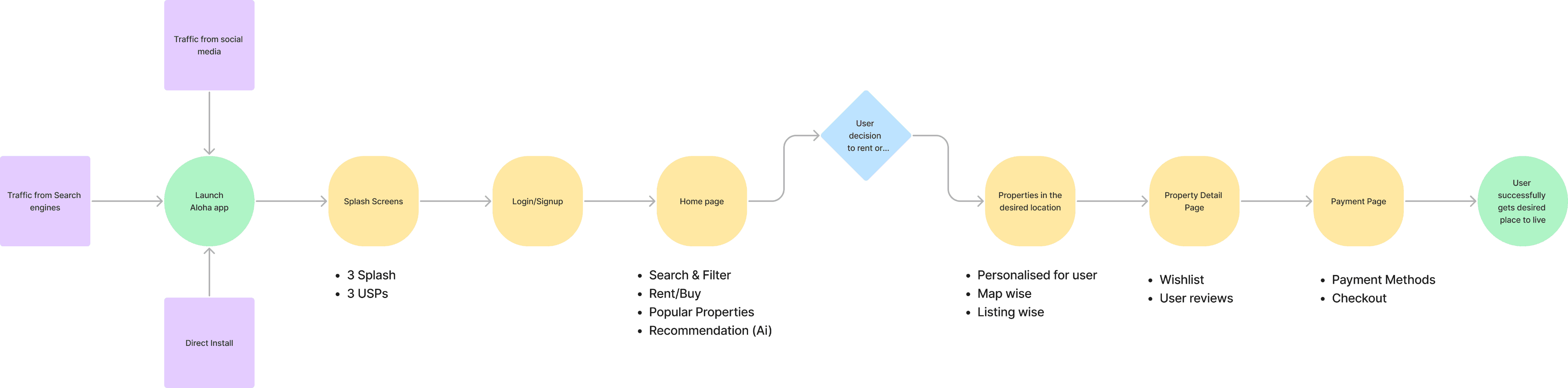
With the business goal in mind, i made sure the steps for a user to get from point A to point B should be kept minimal as well as without much of a distraction to choose clearly and pass on to the very next step easily. After defining user personas and using other brand's application, i iterated many times to come-up with a very minimal and idealistic user flow which has been kept simple to not over complicate the app in its very 1st development phase.
With the business goal in mind, i made sure the steps for a user to get from point A to point B should be kept minimal as well as without much of a distraction to choose clearly and pass on to the very next step easily. After defining user personas and using other brand's application, i iterated many times to come-up with a very minimal and idealistic user flow which has been kept simple to not over complicate the app in its very 1st development phase.
Initial Sketched Ideations
Initial Sketched Ideations
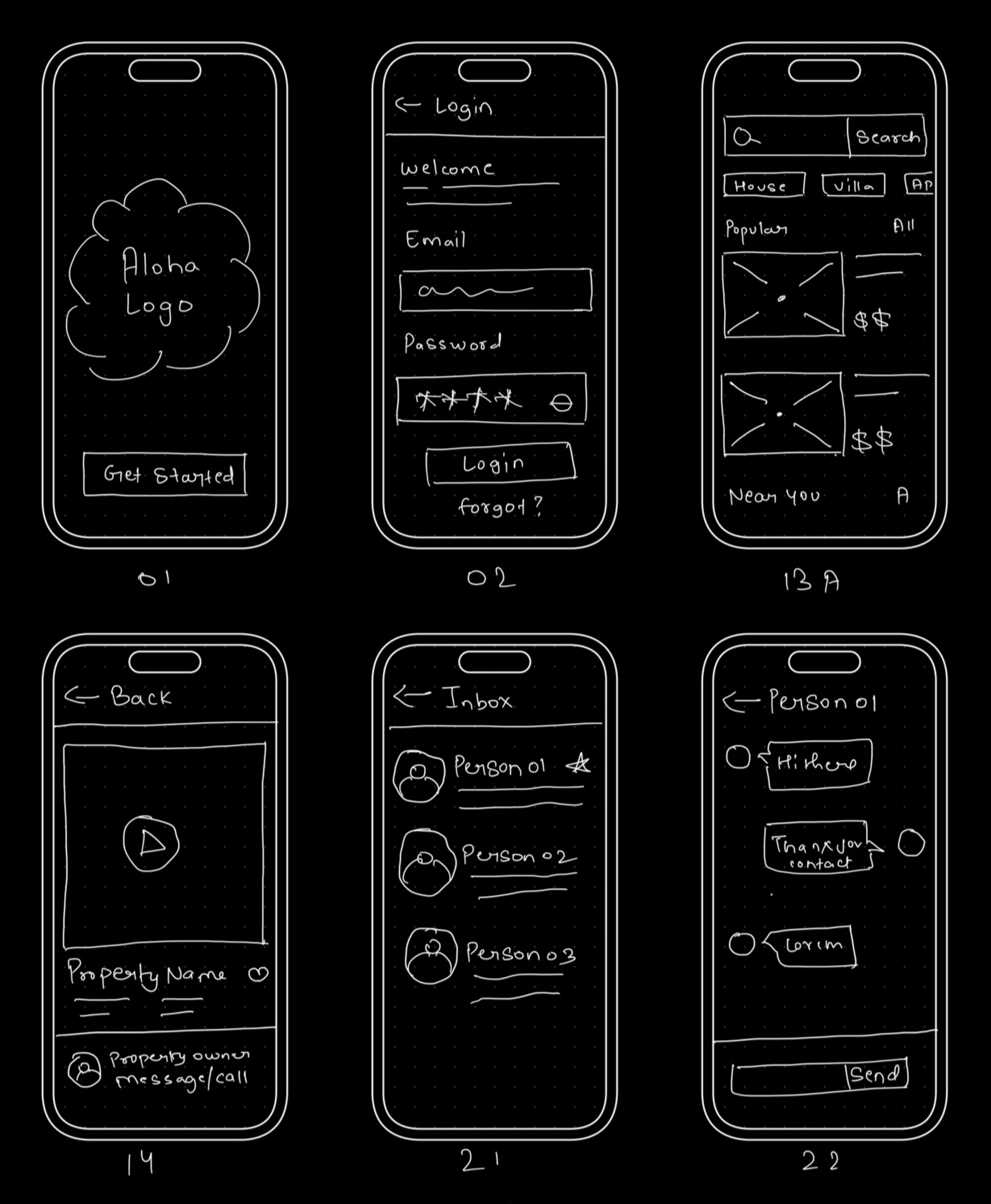
After getting done with the steps a user has to take to experience the app and its features, i began the designing process with rough sketches and doodles for finalising the overall design structure of the app. For sketching, first i used note & pen and then the iPad app mockup came handy.
The very idea of sketching out the whole journey feels boring to some, but for me, it provides me clarity on the overall journey, the information architecture, basic UX laws as well as market trends which are used by our target users.
The main purpose of sketch is to give my ideas a form to later iterate upon and include them in wireframes.
It helped me in getting clarity on design structure, information sorting, basics of UX and market trends which i later incorporated in the design.
Earlier sketches were more traditional in terms of their User experience but later i iterated and added minor differences which makes the app's ui feels similar to the user to not get lost or feel like total new.
High-Fidelity Wireframing
High-Fidelity Wireframing
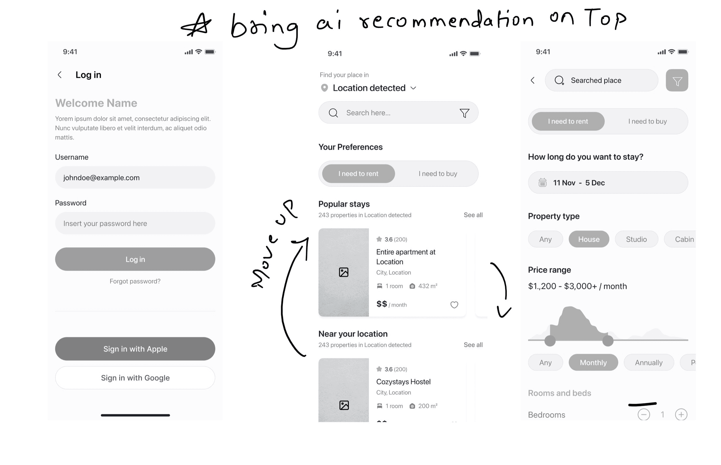
During the wire-framing stage, i tried to many iterations to finalise not just the design structure but also the information structure to ease the user experience and also make use of the app's competitive moat. Stage wise reporting to the client, letting them test the wire-frame enabled me to make some changes in this stage only which later got correctly deployed.
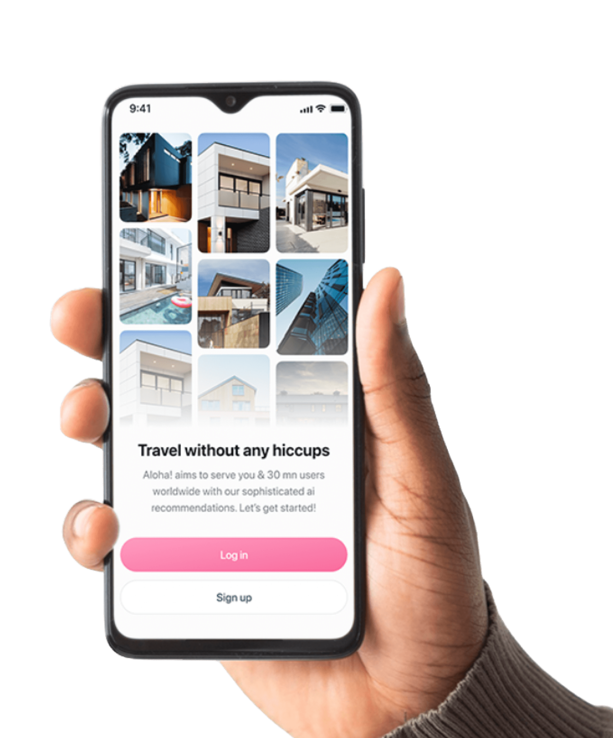
For example, you may notice one major iteration of moving the "nearby recommendations" on top from the early versions where i kept it below popular stays. This recommendation is ai powered algo which detects the user's location and provides them with personalised recommendations to choose from. Later the user can go expensive and choose from popular or luxury stays if they wish.
These minor changes looks small but they make huge difference in making or breaking a mobile application's ease of use.
These minor changes were later incorporated into the final User interfaces
During the wire-framing stage, i tried to many iterations to finalise not just the design structure but also the information structure to ease the user experience and also make use of the app's competitive moat. Stage wise reporting to the client, letting them test the wire-frame enabled me to make some changes in this stage only which later got correctly deployed.
For example, you may notice one major iteration of moving the "nearby recommendations" on top from the early versions where i kept it below popular stays. This recommendation is ai powered algo which detects the user's location and provides them with personalised recommendations to choose from. Later the user can go expensive and choose from popular or luxury stays if they wish.
These minor changes looks small but they make huge difference in making or breaking a mobile application's ease of use.
These minor changes were later incorporated into the final User interfaces
Visual Design
Visual Design
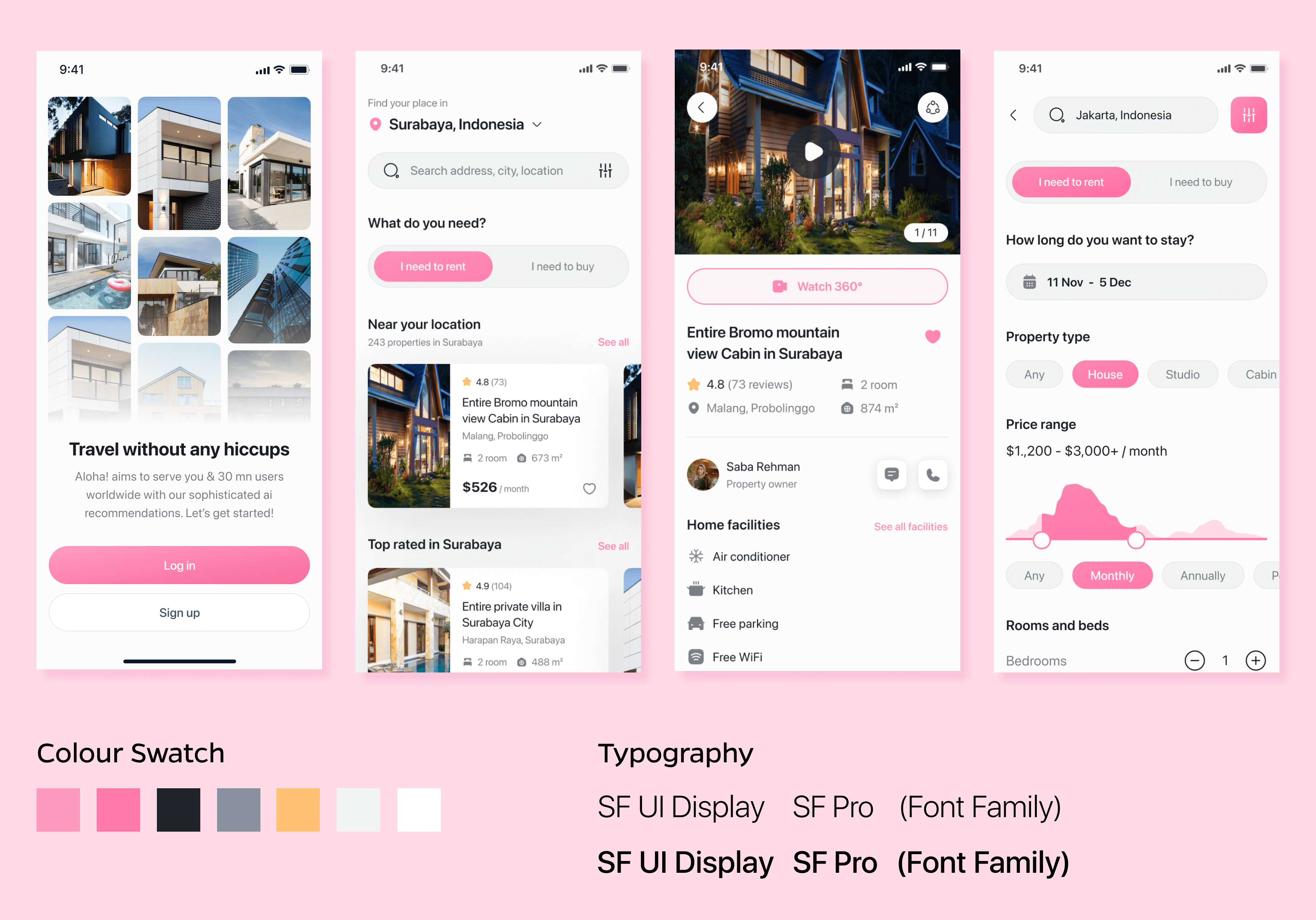
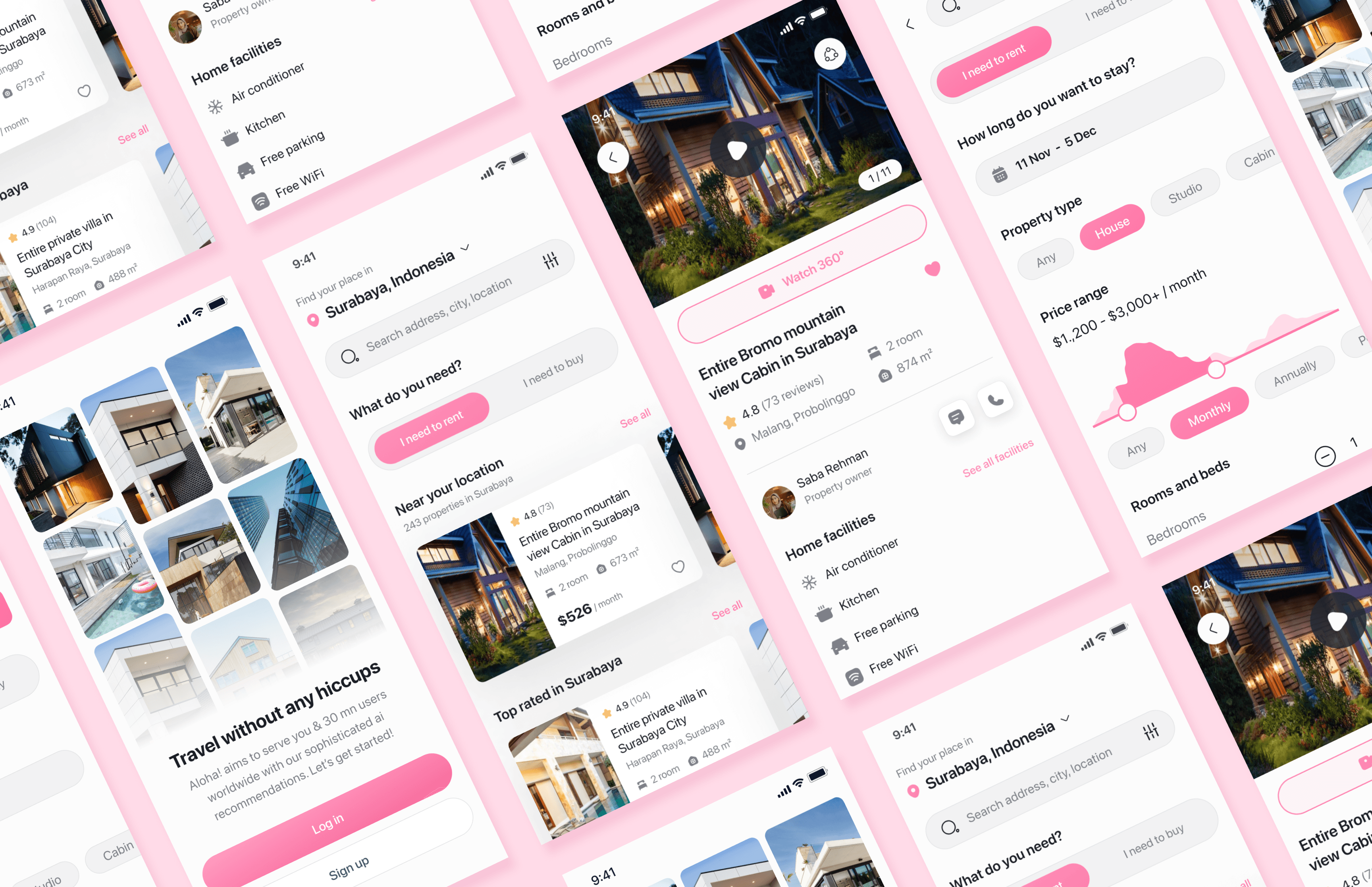
Once we passed the wire-frame phase with green flag on the visual structure and information architecture, i finally got the chance to finalise the user interface in Figma. Now it was the time for me to add visual elements to make the UI looks trendy and modern as per the market and taste of our potential users.
I included minor interactions, friendly colour schemes and neat looking fonts to give this app the premium look & feel it deserves. Final UI also needed different Iconography to meet the visual balance and i designed them separately upon need.
I kept the overall look and feel more roundish than sharp corners to communicate silently to the users that "we are soft people like you who understand the problem and we are here with the solution".
The Final Interface was shown to the client for the approval and later i had to work upon few screens which required little complex interaction design.
My Learnings
My Learnings
This Project gave me the much needed opportunity of working on an ai powered business and trust me, it may sound fancy but it requires a product designer to not just trust what's been done but to go extra mile and build upon the very USP the business is selling.
For me, it challenged me to avoid what others are doing and come up with something fresh. It required heavy research and too many iterations but in the end, it was all worth it.