UX UI Case Study
Bottle-neck of the
Combo Purchase
Taking the 20% user drop off to
0.9% in three weeks, thus helped
MyGlamm save millions daily.


Problem Statement
At the morning meet up with PAN India Product Managers, we the eCom pod product design team were shown something very alarming. It was the metric showing drop off of MyGlamm’s whopping 20% of usual buyers when it comes to buying “Combo Deals”.
Buyers were not proceeding ahead to make the checkout and were backing off due to many UX problems throughout the buying journey.
Our Challenge
For us, the real problem was the timeline crunch in which we had to solve this bottle-neck and bring down the daily losses MyGlamm was bleeding daily.
We were given three weeks (Yes, 15 working days) to present our design solution to the development team and product managers for A/B Testing.

Target Audience
MyGlamm’s primary users are Gen-Zs and early Millennials living in urban India, spanning tier 1 to tier 3 cities.
These digitally savvy individuals are always online and heavily influenced by global and local trends. Gen-Zs, aged 12-27, are experimental and love to explore new brands, while early Millennials, aged 28-40, prefer reliable and value-driven options.
Both groups are mobile-first shoppers, spending significant time on Instagram, YouTube, and WhatsApp for inspiration and purchases.
Gen-Zs are quick decision-makers with an attention span of just 8 seconds, thriving on bold visuals, influencer endorsements, and personalised recommendations.
Millennials, on the other hand, take a slightly more measured approach, relying on reviews and in-depth product details to make informed choices.
Price sensitivity is common to both groups, but they’re willing to splurge on high-quality, sustainable, or trendy products. Flash sales and limited-time offers resonate strongly with Gen-Z, driven by FOMO, while Millennials appreciate loyalty programs and consistent value.
Convenience is key for these users—they expect smooth, intuitive shopping experiences with features like quick checkouts, easy navigation, and fast delivery. Social commerce is a growing trend, with Gen-Z actively shopping through Instagram and WhatsApp while Millennials blend these platforms with trusted eCommerce sites like Nykaa or Amazon.
Finally, sustainability matters—eco-friendly packaging, refill options, and cruelty-free products are a hit with both groups. Post-purchase, Gen-Zs love sharing their experiences on social media, while Millennials engage with reviews and loyalty programs.
Our Approach
With that of a tight timeline, the approach we use was itself a game changing and very important aspect of this project.
We chose to take fast-paced UX process with clear roles and responsibilities given to each and every member of the team.
My role was to dive deep and find the very “Why” this is happening along with current UX Audit of the entire purchase flow of the combo deals.
The Responsibilities
Design Strategy
Problem Solution
Information Architecture
Empathy Mapping
Usability Testing
Prototyping
Competitive Analysis
Wire-framing
User Flow
Visual Design
Iterations
Tech Handoff
Design Process we followed
Emphatize
Define
Ideate
Design
Test
User Research
User Interview
User Persona
User Journey Map
Brainstorming
User Flow
Sketch Wireframes
Visual Design
Prototype
Check Usability
Improvements
Project Timeline
UX Design
1st Week
Strategy
(Research)
Interview, User
Journey Map
Problem Statement &
Goal Statement
Competitive Analysis &
Information Architecture
UI Design
2nd & 3rd Week
Sketch
Wireframes
Usability
Testing Phase
Visual Design
& Prototyping
Emphatize Phase
Qualitative Research
We conducted user interviews with a diverse group of Gen-Zs and Millennials from tier 1 to tier 3 cities. Our interview questions aimed to dive into their shopping behaviours, frustrations, and expectations.
Few of the Interview Questions we used at that time:
How often do you shop for beauty products online?
What do you look for in a combo deal?
Can you walk us through your experience when selecting a combo product on MyGlamm?
Were there any points where you felt confused or frustrated?
What would make your shopping experience smoother?
Key Insight Derived
Clarity and Transparency: Users found the product listing page for combos confusing, as it lacked clear information on what was included in the deal.
Navigation Challenges: Gen-Zs struggled with navigating between products within the combo, especially on mobile.
Pricing Confusion: Both groups were unclear about individual vs. combo pricing, leading to hesitation at checkout.
Visual Confusion: Millennials mentioned that the UI didn't guide them effectively, making it hard to differentiate between deal options.
Cart Clutter: Users reported feeling overwhelmed by unnecessary steps or duplicate items in the cart.
Quantitative Research
We supported these insights with data collected through surveys and user behavior analysis.
No. of users dropped off from the cart page
while purchasing combo deals
Dropped
Cleared
67%
33%
60%
40%
No. of users found the combo
selection process confusing
Confusing
Easy
No. of users wanted clearer pricing
breakdowns on combo deals
Wanted
No Demand
80%
20%
76%
24%
No. of users said they preferred a more streamlined
cart page with fewer steps.
Preferred
Adjusted
No. of users highlighted the lack of visual clarity in
navigating combo options as a key frustration.
Yes
No
62%
38%
Key Insight Derived
Pricing Confusion: Both Gen-Zs and Millennials struggled to differentiate between individual product prices and combo deal savings, making them second-guess their purchase decisions.
Navigation Challenges: The navigation experience within the combo product flow, especially on mobile devices, felt clunky and unintuitive, frustrating users.
Overwhelming Cart Experience: Users felt the cart page was cluttered and complicated, with unnecessary information and repetitive items causing cognitive overload.
Lack of Visual Guidance: Poor visual hierarchy on the product listing and cart pages failed to direct users’ attention to key actions like selecting or confirming combo options.
Define Phase
User Persona
Rhea is a 22-year-old social media manager from Gurugram, always on the lookout for trendy, cruelty-free beauty products. A tech-savvy Gen-Z, she loves sharing her beauty finds online and values quick, transparent, and visually appealing shopping experiences that align with her fast-paced, digital-first lifestyle.
Breif Story
Calm
Thinker
Creative
Personality
Rhea Mehta
Age
Education
Status
Occupation
Location
22
B.M.S
Single
Marketing Manager
Gurugram, Haryana
Goals
To find high-quality, cruelty-free beauty products that suit her active lifestyle
To stay updated on the latest beauty trends and share them with her social media followers
Frustations
Feels overwhelmed by cluttered product listings and unclear combo deals
Dislikes hidden costs or lack of transparency in pricing
Needs
Clear and concise information on product ingredients and benefits
Easy navigation to browse and select combo deals
Rewards, discounts, or loyalty programs to make her feel valued
Motivations
Loves discovering new products to showcase on her personal and professional social media
Feels empowered when supporting eco-friendly or cruelty-free brands
Enjoys seamless, visually appealing shopping experiences

Ananya is a 29-year-old brand manager from Mumbai, juggling her career and family life. A practical shopper, she prioritises quality, value, and efficiency in her purchases. She trusts reliable brands and enjoys deals that offer genuine savings without compromising on her high standards for beauty products.
Breif Story
Calm
Practical
Balance
Personality
Rhea Mehta
Age
Education
Status
Occupation
Location
27
MBA In Marketing
Married
Brand Manager
Mumbai, MH

Goals
To purchase trusted beauty products that align with her professional and personal standards
To find value-for-money deals that fit her monthly budget
Frustations
Gets irritated by poorly designed apps with unnecessary steps
Finds it frustrating when combo deals don’t offer genuine savings
Needs
Detailed breakdown of product pricing and savings in combo deals
User-friendly navigation, especially on desktop during work hours
Assurance of quality and positive reviews from real users
Motivations
Seeks satisfaction in making well-informed purchase decisions
Enjoys saving time and money while shopping for trusted brands
Feels confident using products that have been recommended by peers or professionals
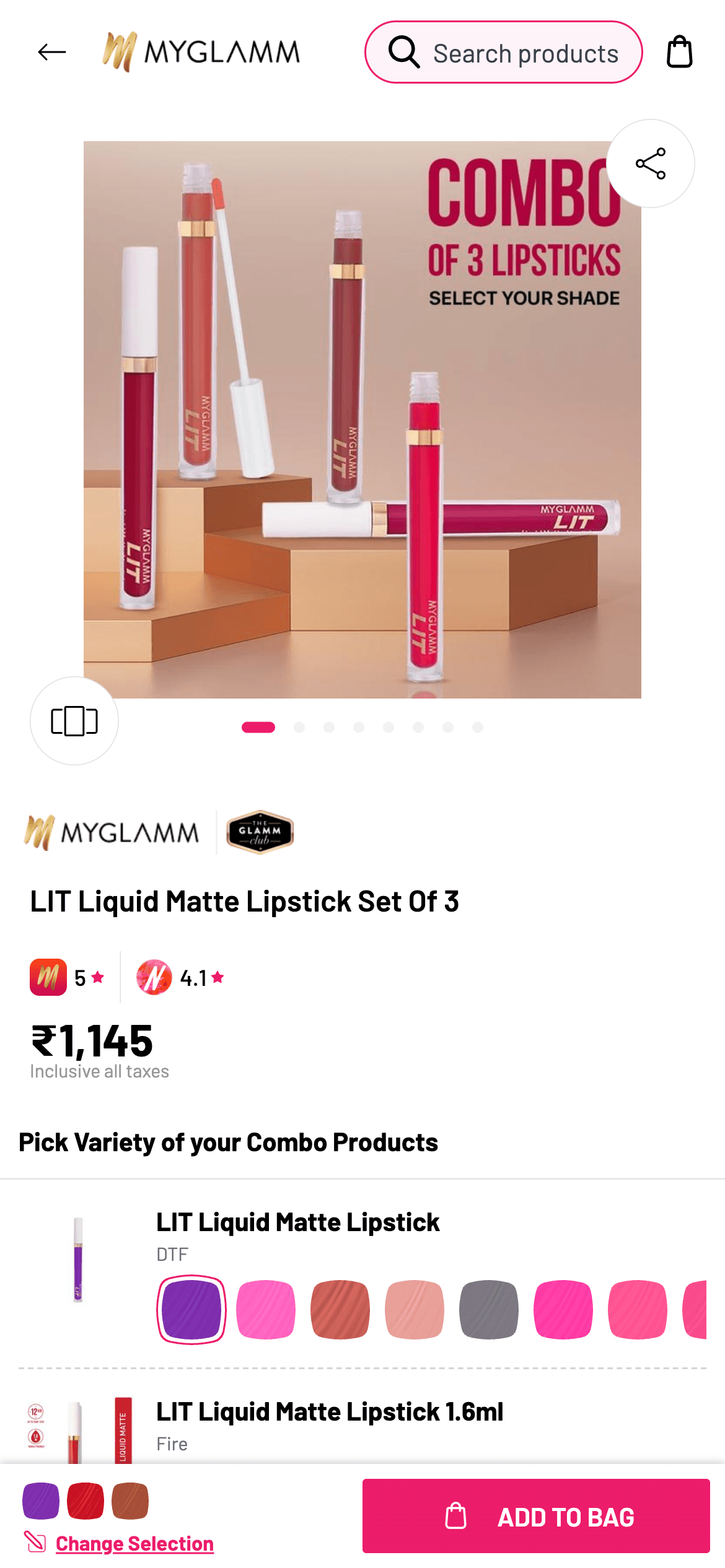
Previous UX
Static Combo Image
No Individual Pricing Clarity
Actual User Chosen Products
The bundle/Combo image which was being shown as primary was static and confusing
on the product selection front.
The confusion starts here when the combo prices are actually shown in total leaving users confused over actual unit price.
The user selected products were being shown in small labels with no option of being able to change shades from here.
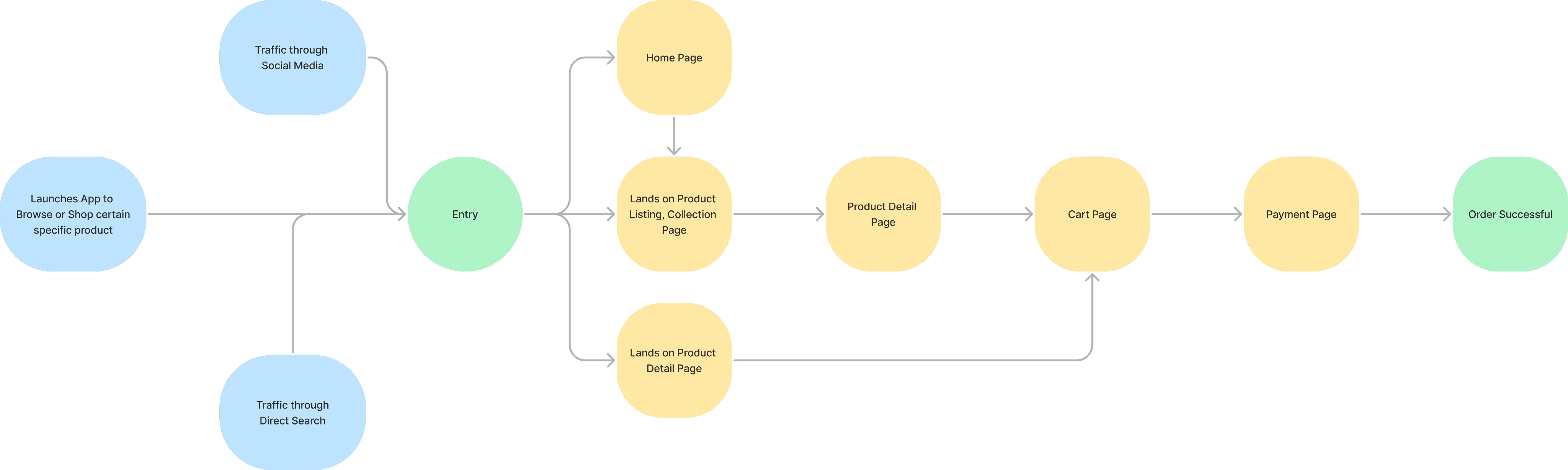
User Flow Simplified
Initial Sketched Ideations
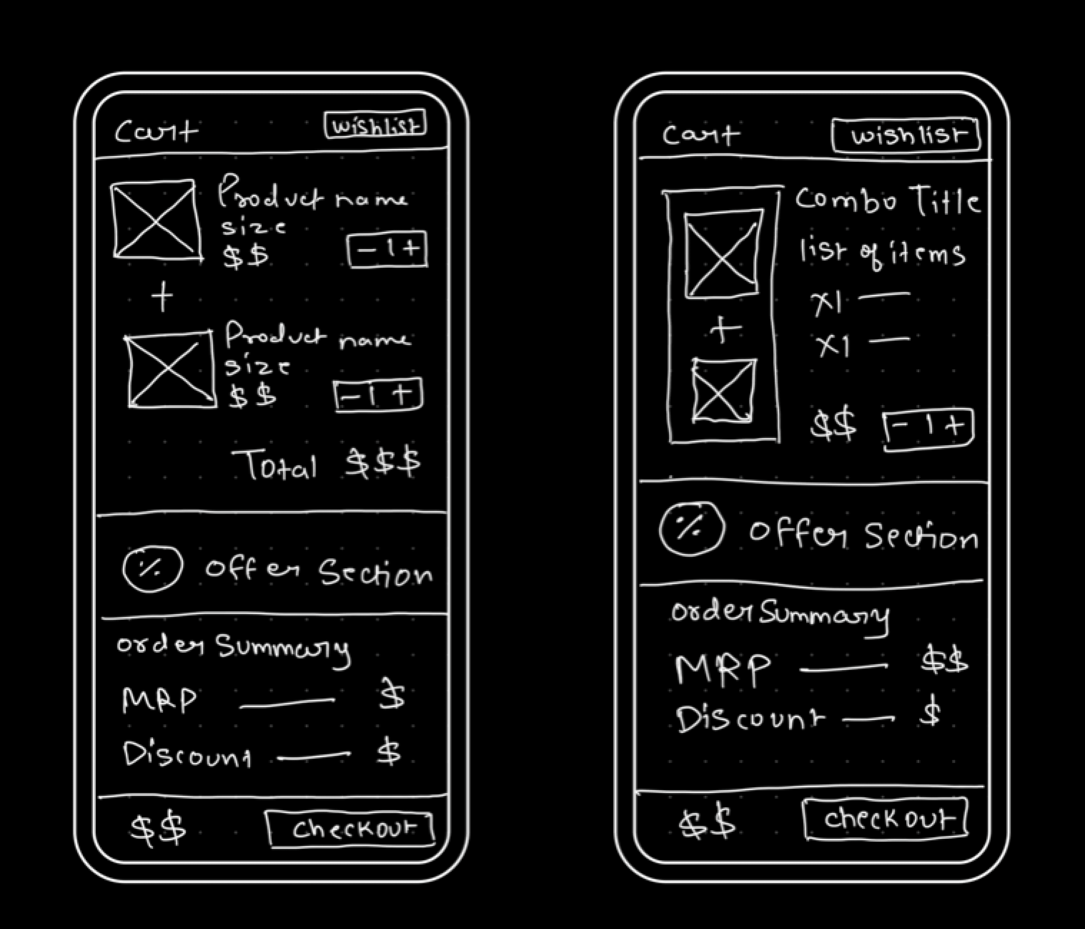
We began the design process with low-fidelity sketches and wireframes to accelerate decision-making through visualisation without losing time. Our sketches were based on the initial user interviews, the business goal, and the heuristic evaluation. They each pointed to the fact that there were too many distractions in the flow. We came back to the sketches throughout the entire design process to make sure that I don’t lose sight of our primary goals and ideas.
The Main Purpose of rough sketching is to see the ideas at least take some form and it eases the brainstorming process for me.
Apart from the core problem, we also draw what's around the problem to never lose sight and presence.
These 2 sketches are two rough ideas we came up with before making them into low fi and wireframe.
I love doodling on my iPad and I use mockup for drawing my sketches.
These Sketches helped us move forward to Low-fi and Wireframes.
High-Fidelity Wireframing
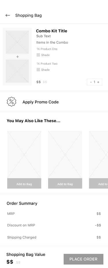
Using Figma, we translated first sketches into High-fidelity wireframes. Then, we improved them by adding a few relevant stock images and copies provided by the marketing team. At this stage, the wireframes were defined enough for some user testing. Based on 4 tests, We’ve made a few alternations and moved on to creating high-fidelity prototypes.
During the process of Wireframing my rough sketches, I noticed few other elements which should be around the product cards and based on my finding I pushed the promo code section on top of Upsell Widget near the combo product cards for A/B testing.
We used Figma for Wireframing in High Fidelities.
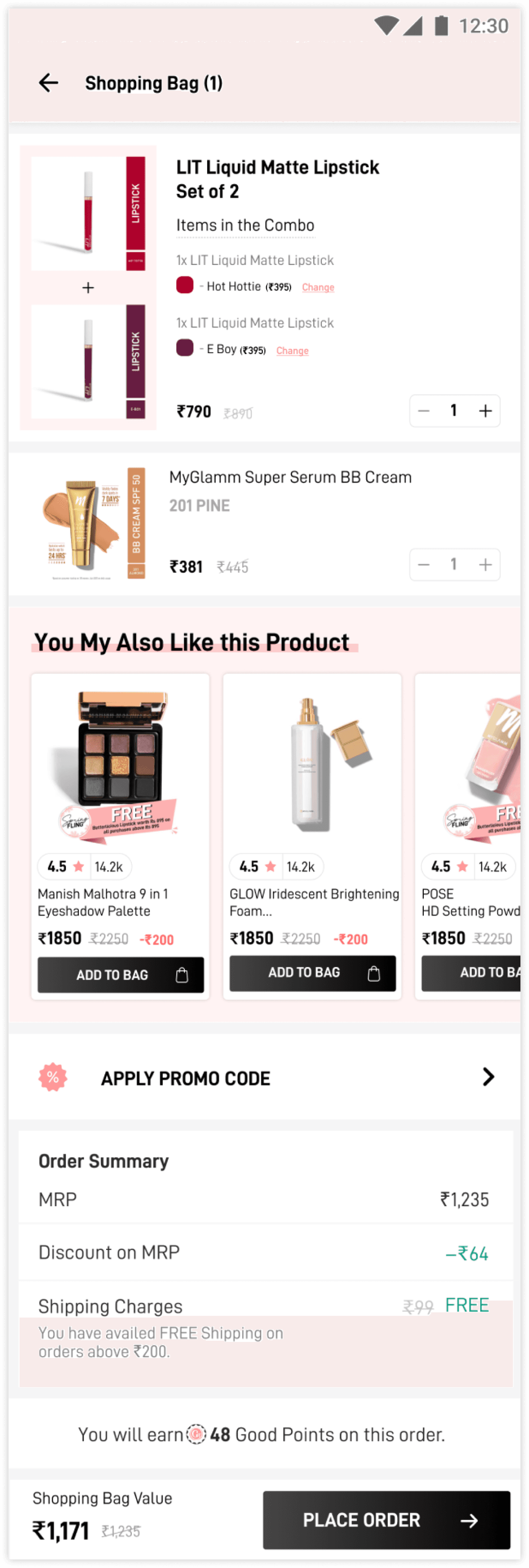
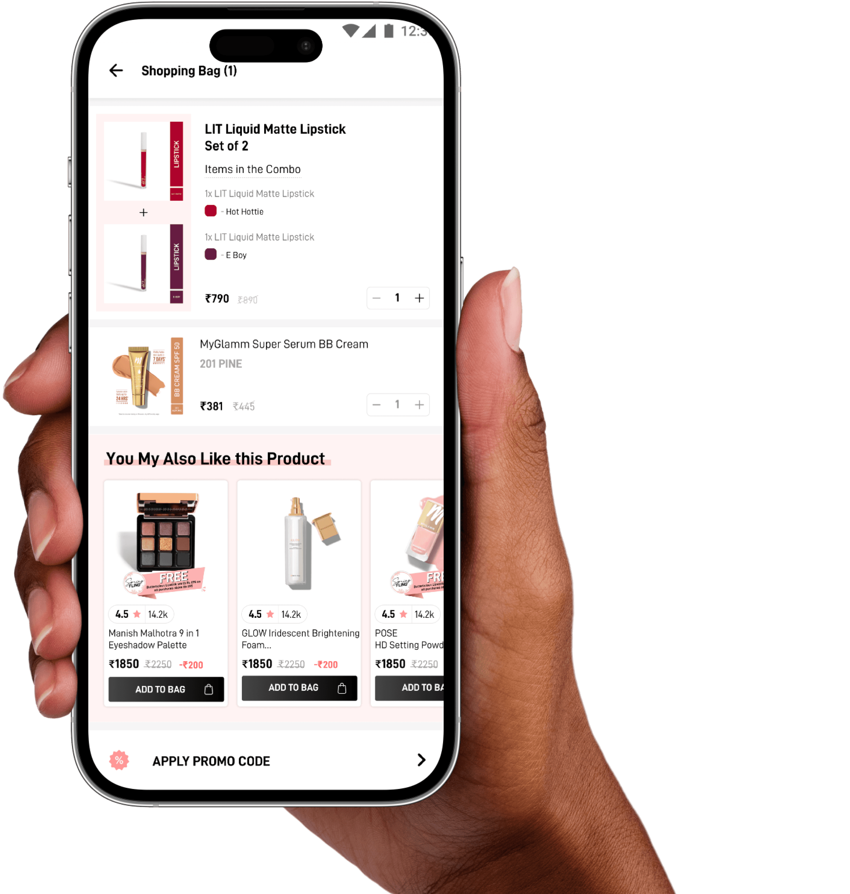
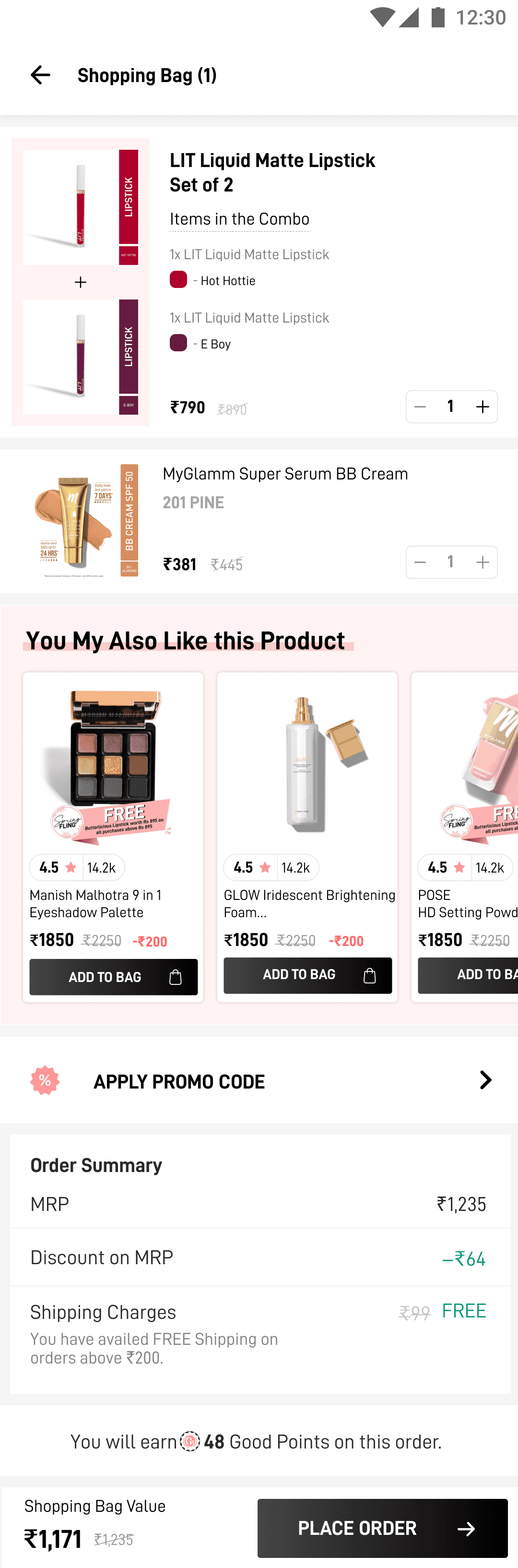
Visual Design
Cart Page
(₹395)
Change
Change
(₹395)
We prioritised clear communication from the very front i.e the very title of the product card together. It helped in understanding the combo deal instantly.
We eliminated the static image problem and instead chose to add user selected product cards in a box like container to resemble they are together and actual selections.
We used simple everyday element like Add sign to instantly convey that these selected products are in a combo deal and user will get both of them in the deal.
We not only shown the individual pricing of the combo products to avoid pricing confusion and build transparency but also made an entry point with bottom sheet where the user can still change the shade of the product without going back to PDP.
Clear Combo Title with No. of Products
Individual pricing + Change option
Simple Add (+) sign for better clarity
Cards container resembling box
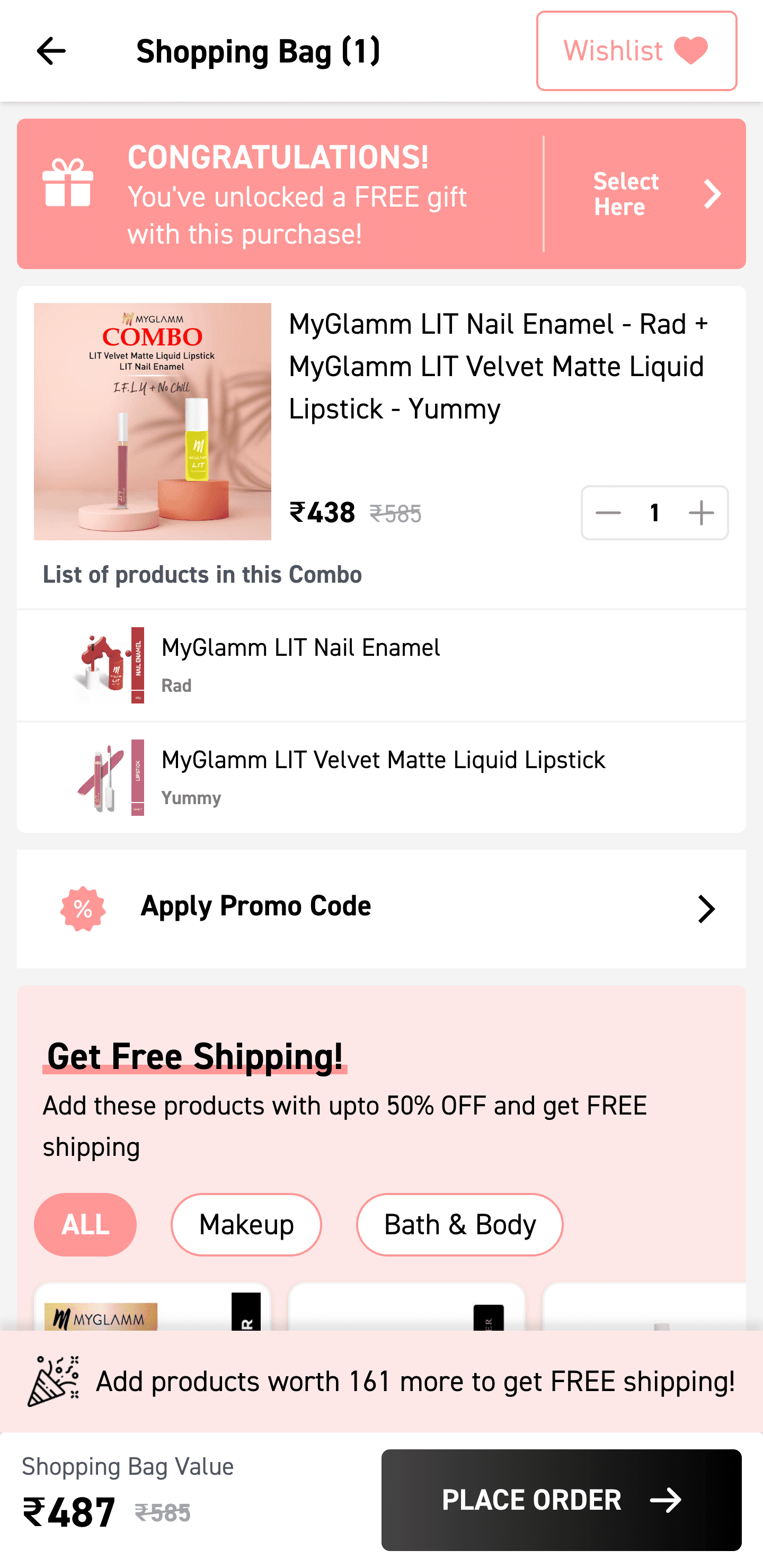
Product Detail Page
Bottom sheet removed,
horizontal scroll added
Seeing the no. of taps on change shade option on the cart page, we further simplified the user flow by going one step back to product detail page and allowed users to make selection seamlessly.
We further introduced the change shade option on the always present sticky bottom bar and allow users make last sec changes comfortably and be less confused on the cart page.
“Change Shade” on the Sticky
bottom bar