UX UI Case Study
The art of decoy pricing and its implementation for better user experience.


Problem Statement
How might we show bundled products with the decoy effect to our users without ruining the current user experience but improving it?
This was the main goal that I wanted to achieve when I started working on this project. The Idea was simple but its proper implementation was the challenge.
Our Approach
I followed the very fundamentals of UX when I was researching and brainstorming for this project. I wanted the solution to be of minimum distraction to the user's eyes but catchy enough to let the user explore the options and pass the buying journey.
By Following the double diamond design thinking, I moved from one phase to another but kept coming back & forth till the final user interface got the green flag.
Team
My Role
Timeline
2 UX Designer
2 Developers
1 Project Manager
UX Research
UX Design
Adaptation into other platforms
Zeplin handovers
Overall : 3+ weeks
Discovery & Research : 2 weeks
Design & Testing: 1+ weeks
Design Process we followed
Emphatize
Define
Ideate
Design
Test
User Research
User Interview
User Persona
User Journey Map
Brainstorming
User Flow
Sketch Wireframes
Visual Design
Prototype
Check Usability
Improvements
Define Phase
During the ideation phase of the project, I conducted user interviews to build a customer journey map and I also wanted to know the very "Core" or "why" people buy and what they expect while buying bundled products. I prepared an interview script with 12 open-ended questions, focusing on our target audience’s values, motivations, and daily routines. In 4 days, I recruited and interviewed 10 users remotely which was arranged by the client. We referenced the user interview findings throughout the entire design process.
Interviews
Through interviews, I wanted to get to the very fundamental "why" of people buying bundled products and what they expect when they do so.
The interview helped me gain insights which I later used in my initial wireframes and then in the final UI.
Bonus Insight: This is the power of Interacting directly with potential users, you may get insights that later help in making killer features and strategies. For this project, almost 40% of users said that they know the tactics company uses to make them purchase more, and upon testing the low wireframes with the most popular tag in the middle, users chose the most popular one over others (This is Social Proofing where users may get FOMO and buy what others buying). So the insight is that upon changing certain copy and their placement, users may still choose the middle one like this trait or behavior is deeply rooted in them.
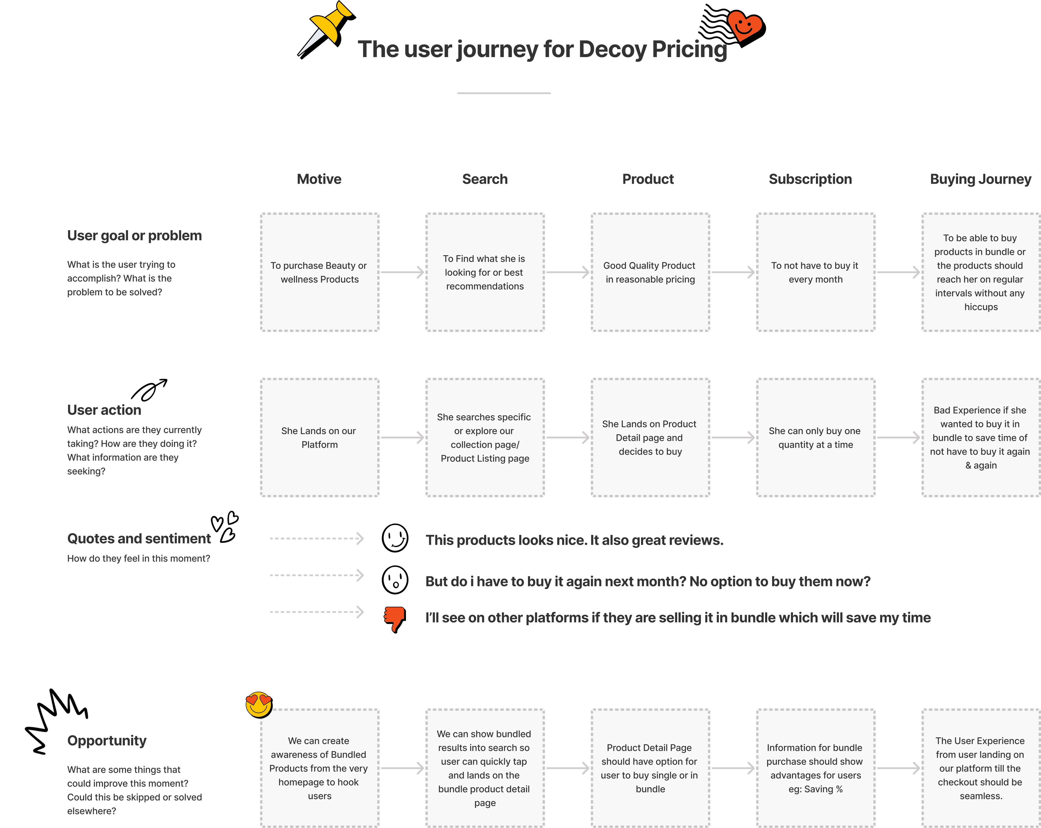
I created a customer journey map to build a better understanding of how customers find and interact with the service and discover opportunities for improvement. The map revealed many user problems, their sentiments, and opportunities at the consideration and loyalty stages of the customer journey. Therefore, I paid special attention to these stages during the design process.
Customer Journey
Through Customer Journey Mapping, I wanted to reach the very Core of Why people buy bundled products
This Mapped Journey helped me to focus on the crucial steps our user has to go to buy the products she wants and where we can introduce Bundled elements with the decoy.
Through mapping out the Opportunities journey, I got ideas of how we can create entry points to create awareness of bundled products from the very beginning.
User Flow Simplified
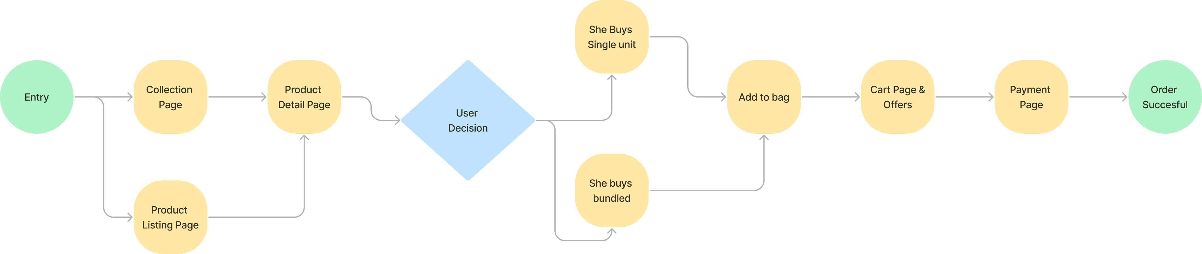
With the business goal in mind, I made sure that our users reach the checkout screen without any hiccups. So, I sketched a current-state user journey map, to identify opportunities for improvement. Upon mapping the steps out, I identified a few unnecessary steps and potential dropoff points in the flow. By eliminating these from the new design, I ended up with a much faster checkout experience that contributed to conversion rates.
I articulated every step involved for the user to reach the checkout page and found a few unnecessary steps which upon elimination resulted in fair user flow to get from Point A to Point B more quickly.
The Below user flow is the fined tuned version that I got after eliminating the unnecessary steps to make it easy for users.
This User flow chart helped me to focus on this feature's important steps which otherwise could've gone the other way.
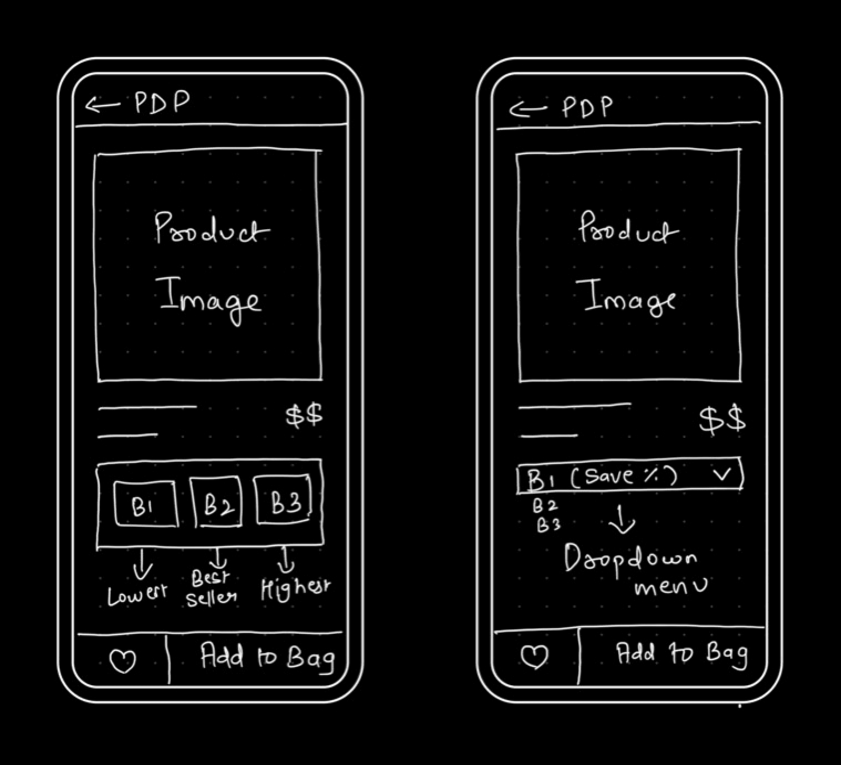
Initial Sketched Ideations
I began the design process with low-fidelity sketches and wireframes to accelerate decision-making through visualization without losing time. My sketches were based on the initial user interviews, the business goal, and the heuristic evaluation. They each pointed to the fact that I just cannot use what's been already been used in the industry, my research showed that when buying bundled products, users are still very fresh on the UI they face. I came back to the sketches throughout the entire design process to make sure that we don’t lose sight of our primary goals and ideas.
The Main Purpose of rough sketching is to see the ideas at least take some form and it eases the brainstorming process for me.
Apart from the core Decoy screen, I also drew out the entire product detail page to know if any elements may interfere with the information hierarchy.
These sketches are a few of the rough doodles I did to know what it will take a user to reach from point A to point B without hassle.
I was trying to include only one primary CTAs to not give users too many distractions to drop off.
These Sketches helped me move forward to Lowfi and Wireframes.
High-Fidelity Wireframing
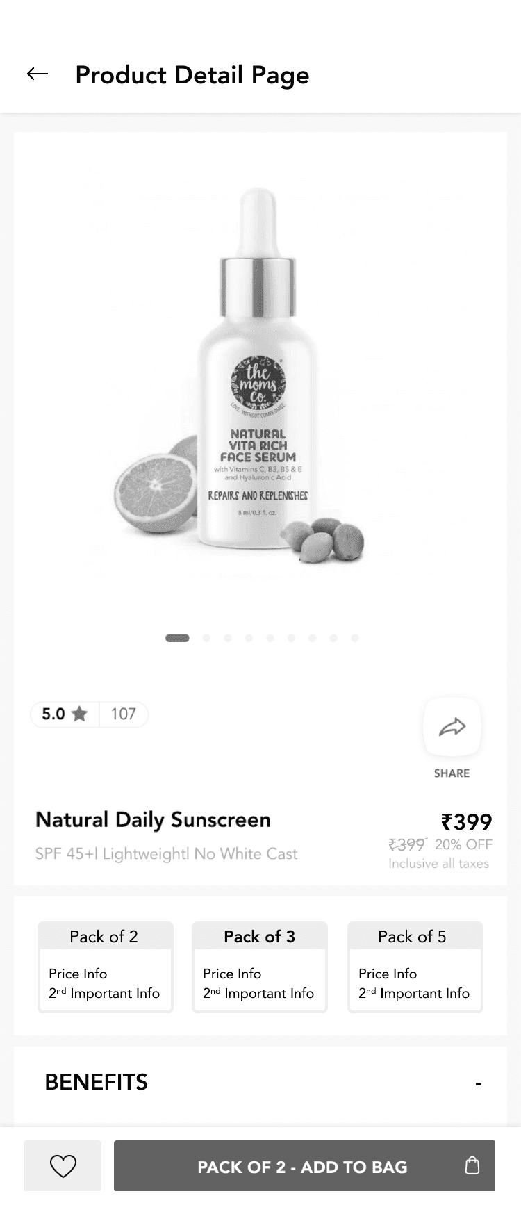
I created Basic Wireframes for 3 options which I came up with after iterating through many and included actual images of the categorised SKUs to understand the sizing and proportions to not make mistakes in the final UI.
Apart from wireframing design structure, I also changed the information type into the bundled products to know what information satisfies the user goal at that time and which information would be nice to include to nudge or motivate users to buy the bundle products through the Decoy strategy.
I created Wireframes for 3 top options I came up with after iterating through many versions.
Not just design elements, but What type of information and their hierarchy were given importance to ideate and test at this point only.
I placed importance on only one Primary CTA to not distract users and get them from Point A to Point B more quickly.
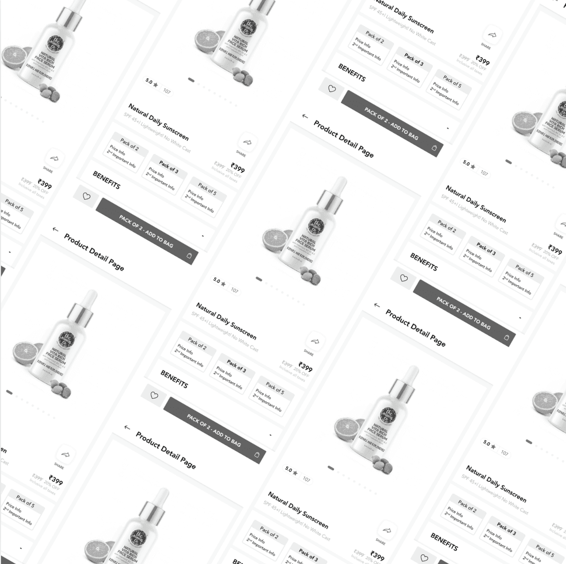
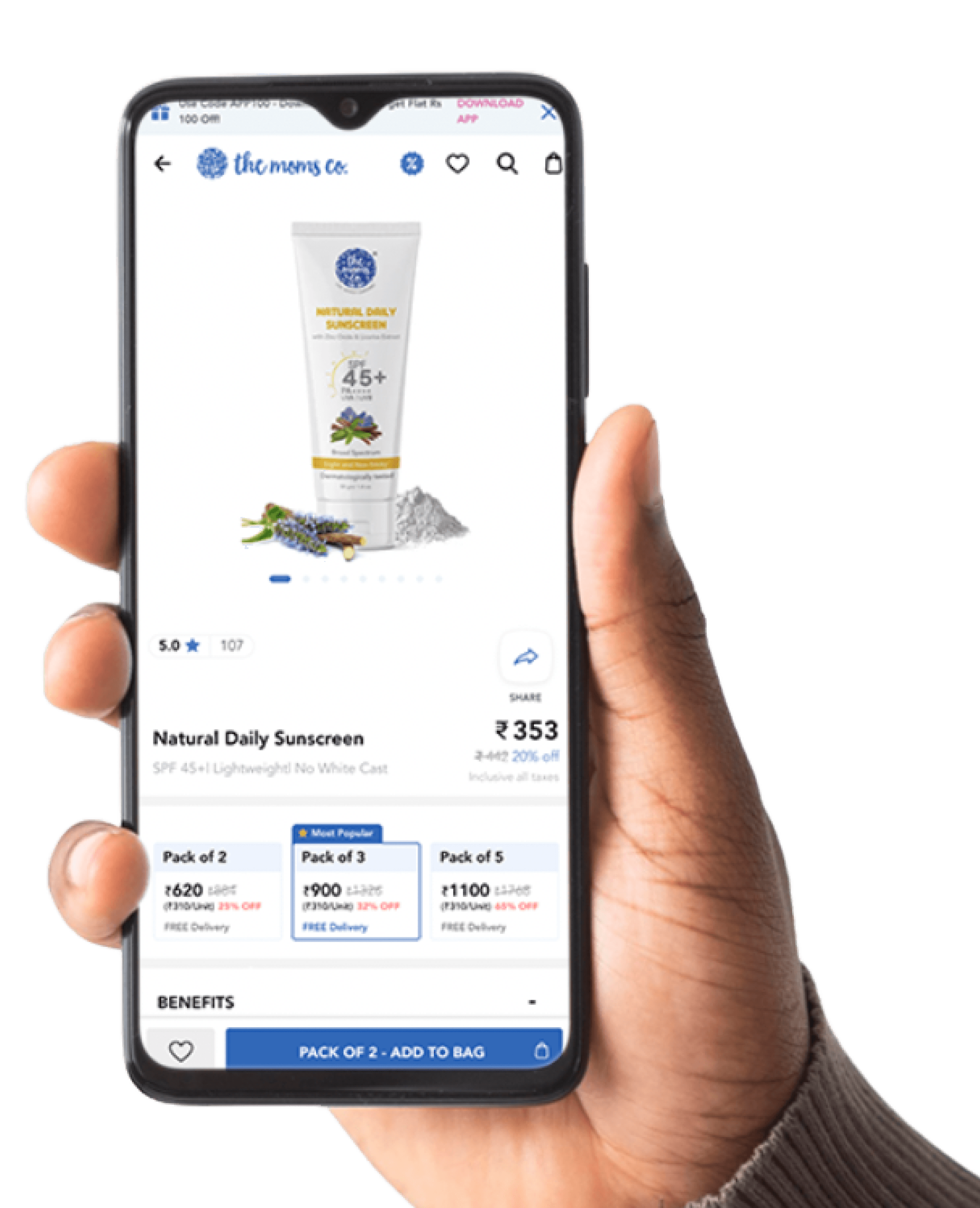
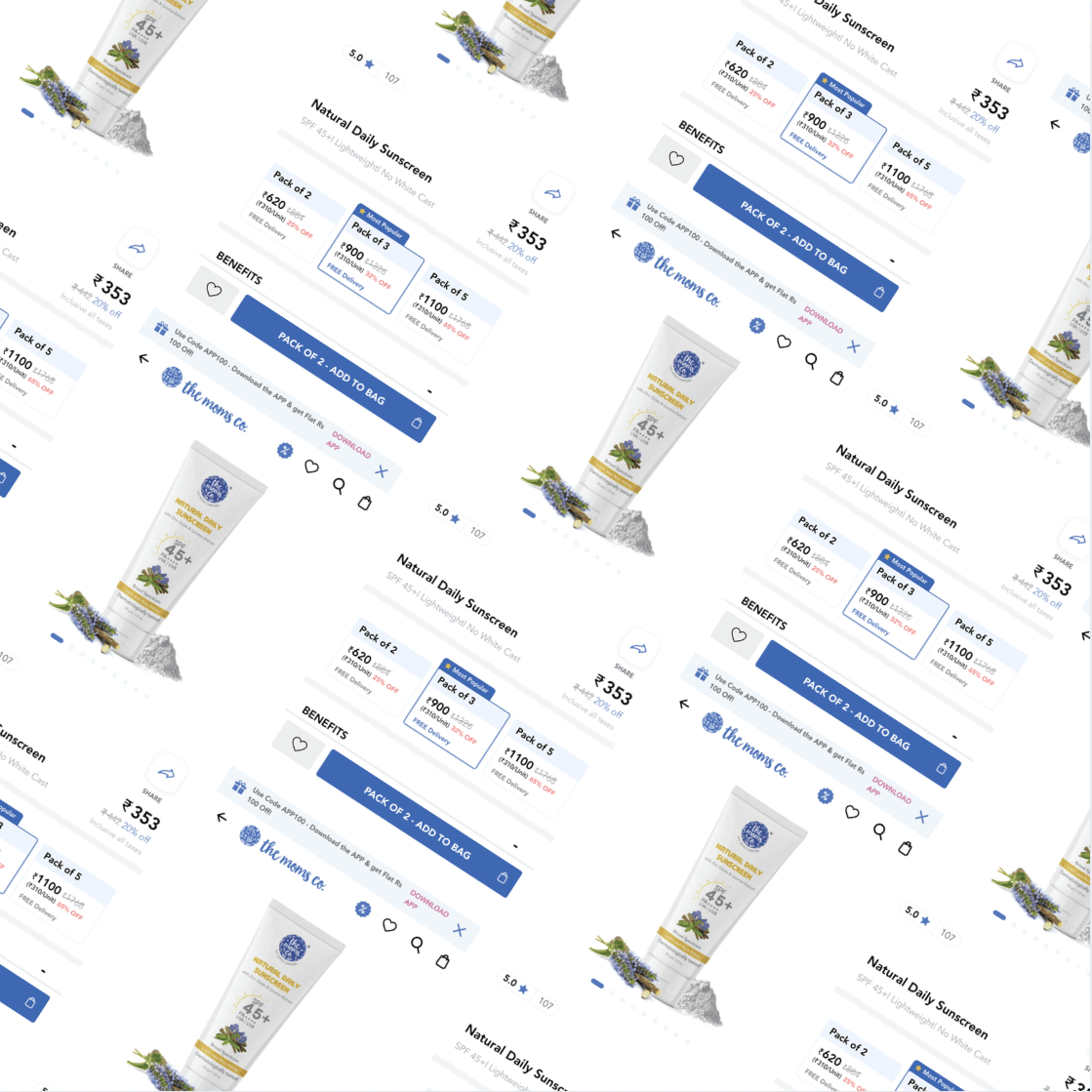
Visual Design
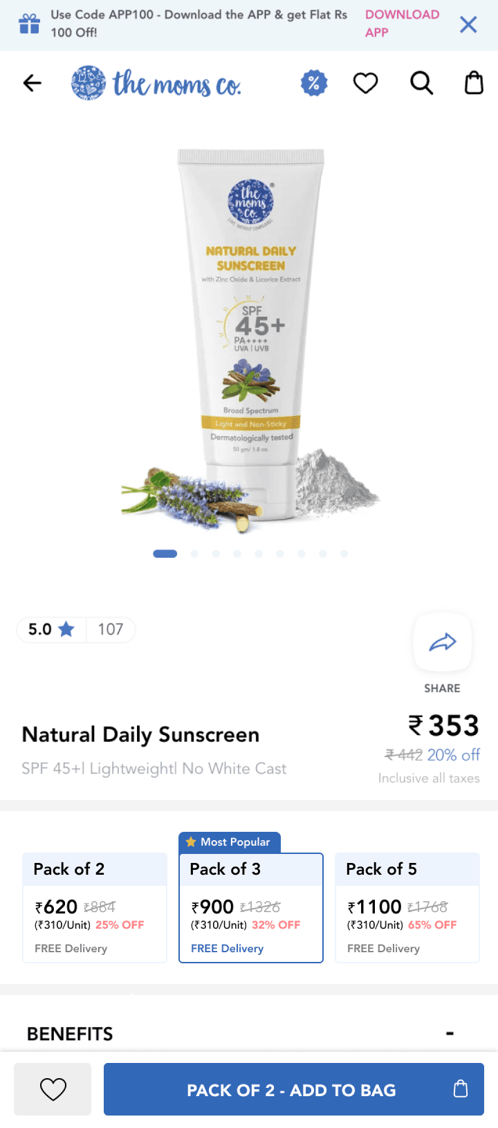
Once the usability issues were resolved, I moved on to design the final screens in Figma. My goal was to design the bundled product elements with the Decoy strategy without ruining the current experience but improving it.
In the final design, a few more elemental changes happened which I came up with after iteration and testing. Along with the design, the Information structure too got finalized upon iterations and testing.
In the Final UI, I did involve only 3 groups to choose from, relevant information which should accompany them, and placed the targeted group or element in middle with the Decoy strategy to induce or motivate the user.
Information Tags such as Most Popular, Best Seller, Hot selling & Trending were used to help the decoy strategy gets into action.
Information such as the Bundle Quantity, The pricing, The Savings along with Free Delivery were shown to satisfy the user's curiosity at that particular moment in time.
These Final Uis were designed and prototyped into Figma which I later used for adaptations for other OS and screen sizes.
I also handed over Zeplin files to get the designs developed.
My Learnings
Decoy effect or decoy pricing was not a new term for me, I've seen it getting used offline by local sellers to the giants like Walmart, However, the usage of Decoy Online especially to drive commerce was something I was excited about. We all have seen websites that show pricing into three groups highlighting the middle one as the best option but that's not it.
My Goal was not to get into the industry biases and map out things on my own, but to design my own way based on real user feedback and interactions.
Throughout this project, I applied basic laws of UX and fortunately it all made sense in the end when I delivered the final UI to the product team.