
UX UI Case Study
Software as a Service (Saas)
Shade Finder
Improving user experience when it comes to finding the right foundation shade online


Problem Statement
How might we help a user looking to buy a matching foundation shade with her skin tone?
In the Makeup E-Commerce Industry, Foundations are among the top 5 hot selling makeup products and this project was around this only.
Here the Problem was not just partnering with the right vendor for skin or face analyzing technology but keeping the User Experience Simple, easy to use, and yet Visually appealing to our users.
Target Audience
The Target user base were Females living in Metro cities, between 16-30 years of age and we have to devise a gamification based Feature which should also not feel like too much steps to do. It was to be kept very simple and easy to use.
Our Approach
In the 2 weeks timeline, what we did was researching 70% of the time and we came up with pretty neat solutions which upon ideations and iterations, helped us to land on our final UI design.
When working on the solution part, I followed core fundamental laws of UX especially by Jakob and Hicks from which I kept the new feature easy to use, familiar and without too many distractions.
You will see that in ideations, iterations and in the final User Interface.
Team
My Role
Timeline
1 UX Designer
2 Developers
1 Project Manager
UX Research
UX Design
Adaptation into other platforms
Zeplin handovers
Overall L 2 weeks
Discovery & Research : 1.2 weeks
Design & Testing: 0.8 weeks
Design Process we followed
Emphatize
Define
Ideate
Design
Test
User Research
User Interview
User Persona
User Journey Map
Brainstorming
User Flow
Sketch Wireframes
Visual Design
Prototype
Check Usability
Improvements
Define Phase
User Persona
Pooja Rai is 26 years old married lady who works as a wealth manager in a bank located in Mumbai. She lives in a joint family with her husband and her in laws. She is a social being who likes to work, gossip with her ‘girls gang’ as she describes her group of friends. She likes cooking, beauty influencers, and looking after her family when she is not working.
Breif Story
Pooja Rai
Age
Education
Status
Occupation
Location
26
Wealth Management
Married
Banker
Gurugram, Haryana
Goals
Be at-par with her social group
Become succesful influencer
Complete her study and become a professional.
Frustations
Study
Being Social
Beauty and Makeup
Needs
She needs social satisfaction
Wants to grow in her career
Wants to know what’s working and what’s not to achieve her goals
Motivations
Keep herself up to date with trends, fashion etc
Keep learning new skills and grow in her influencing career
To do what can make her medical professional

Nidhi Bishnoi is a 19 year old single lady who is pursuing medical science in one of the reputed college in New Delhi. She lives in a Nuclear family with her elder brother, dad and mom. She is a social being who likes to chit chat with her college friends, go on trips or night out with them. She likes making beauty related content and wanabee a social media superstar.
Breif Story
Nidhi Bishnoi
Age
Education
Status
Occupation
Location
19
Medical Science
Single
Content Creator
Delhi
Goals
To purchase trusted beauty products that align with her professional and personal standards
To find value-for-money deals that fit her monthly budget
Frustations
Gets irritated by poorly designed apps with unnecessary steps
Finds it frustrating when combo deals don’t offer genuine savings
Needs
Detailed breakdown of product pricing and savings in combo deals
User-friendly navigation, especially on desktop during work hours
Assurance of quality and positive reviews from real users
Motivations
Seeks satisfaction in making well-informed purchase decisions
Enjoys saving time and money while shopping for trusted brands
Feels confident using products that have been recommended by peers or professionals
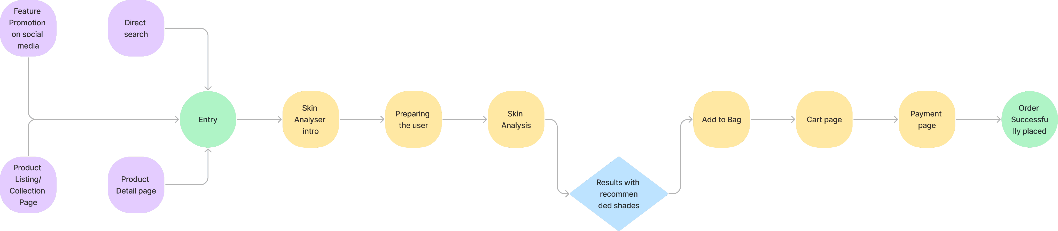
User Flow Simplified
Initial Sketched Ideations
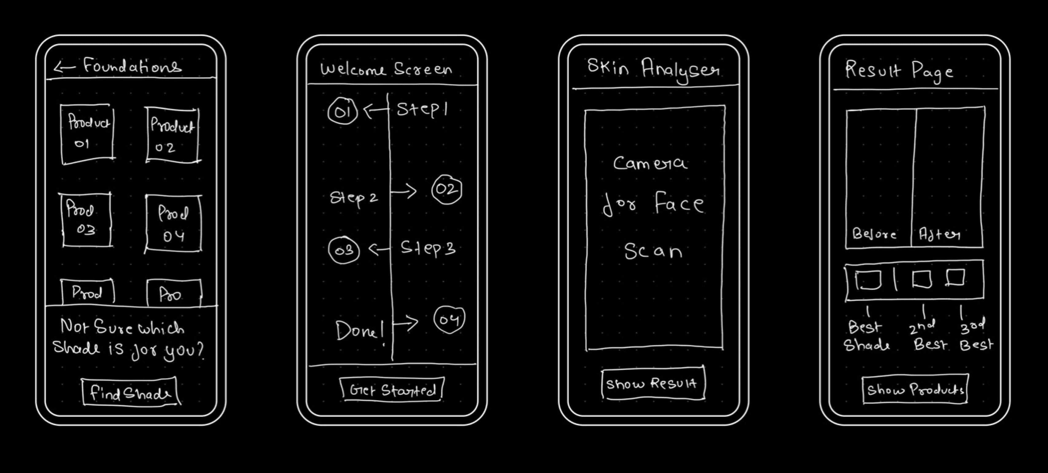
I began the design process with low-fidelity sketches and wireframes to accelerate decision-making through visualization without losing time. My sketches were based on the market study, the feature goal, and the heuristic evaluation. They each pointed to the fact that there were few distractions in the flow. I came back to the sketches throughout the entire design process to make sure that i don’t lose sight of our primary goals and ideas.
The Main Purpose of rough sketching is to see the ideas at least take some form and it eases the brainstorming process to me.
Apart from the core feature screen, I also drew how the user will reach it from the very initial nudge point.
These sketches are few of the rough doodles I did to know what it will take a user to reach from point A to point B without hassle.
I was trying to include only one primary CTAs to not give user too much distractions to drop off.
These Sketches helped me move forward to Lowfi and Wireframes.
High-Fidelity Wireframing
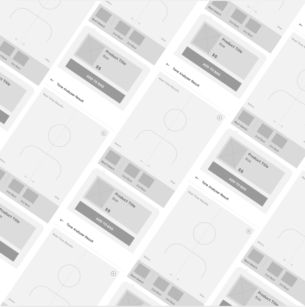
Using Figma, I translated my first sketches into low-fidelity wireframes. At this stage, the wireframes were defined enough for some user testing. Based on few quick tests, I’ve made a few alternations and moved on to creating high-fidelity Wireframes. Then, I improved them in High fidelity by adding a few relevant stock images and copies provided by the marketing team.
During the process of Wireframing my rough sketches, I noticed initially I ideated two separate screens for results and recommended products, but when working on these wireframes, I realised that I can eliminate unnecessary step and can make both screens into one for better user experience.
I used Figma primarily for Wireframing and Prototyping.
Visual Design
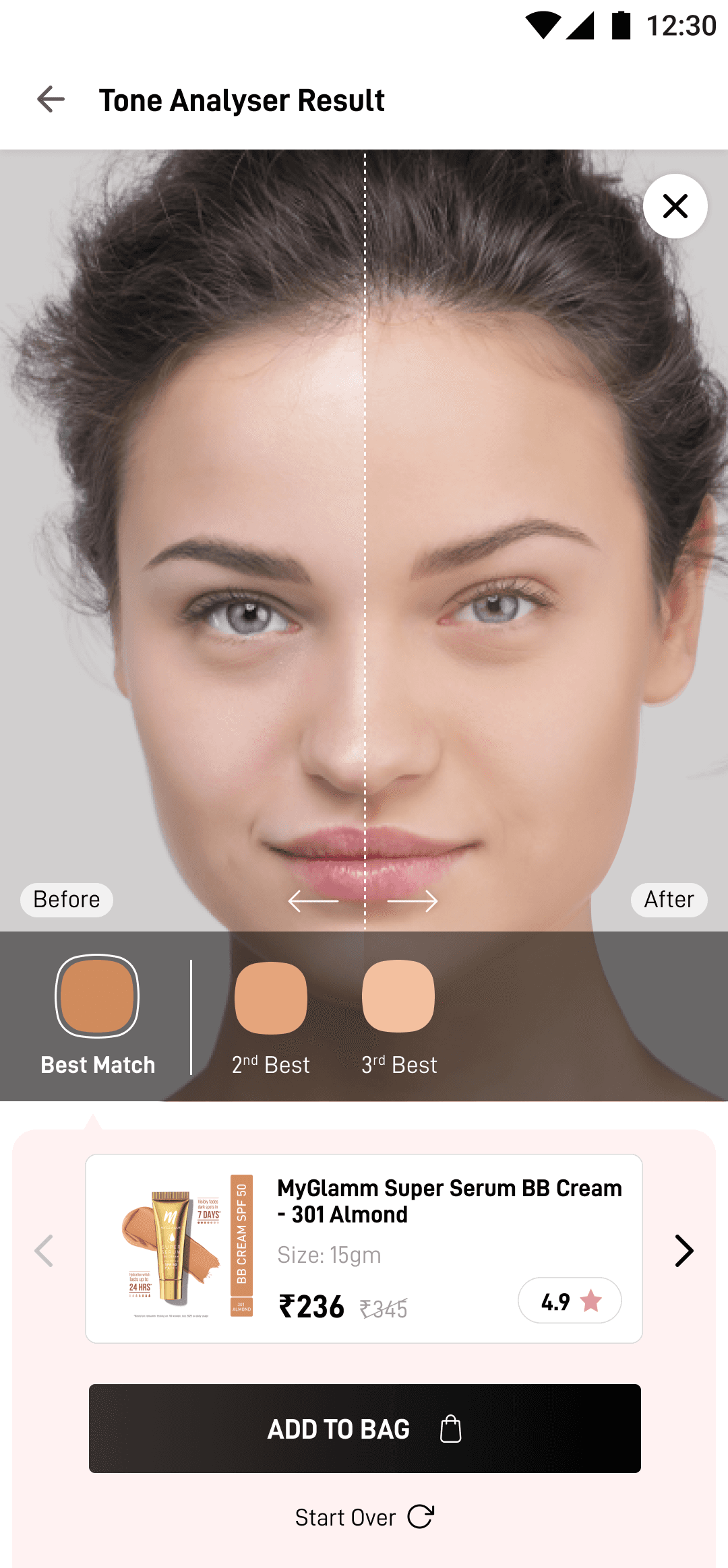
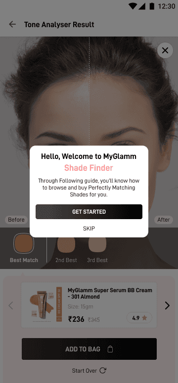

Once the usability issues were resolved, I moved on to design the final screens in Figma. My goal was to create a visually nice yet within the branding of the organisation UI which should speak for itself.
I had to use the Brand colours, fonts already defined by the management and also their product catalogue.
The Final UI design was made and adapted for Mobile Web, Android and iOS platforms.
For Easing the development part, I delivered this whole project into Zeplin adaptations which helps developer and the management to ease the production cycle.
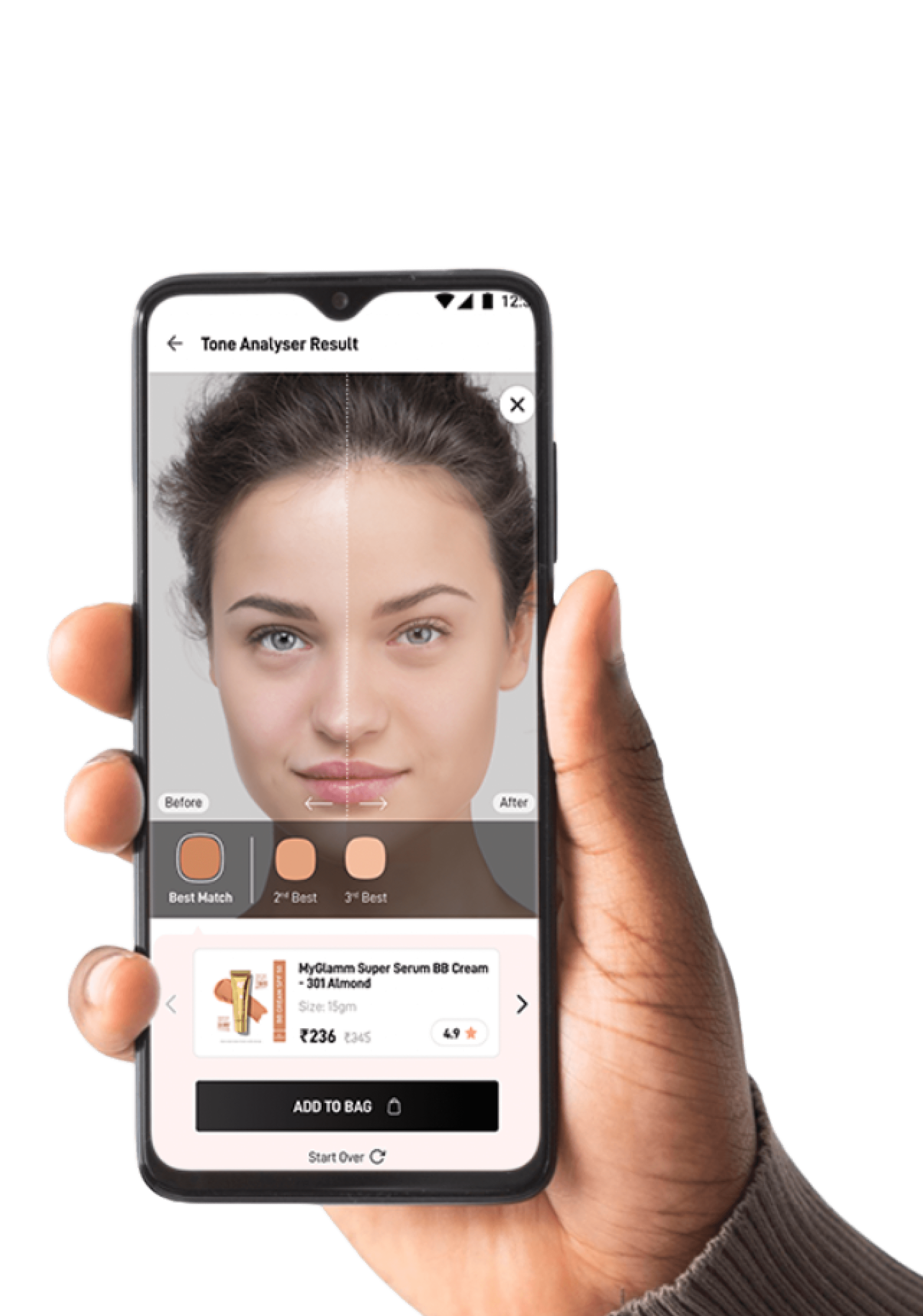
I learned few more elements were added and removed when we were doing final testing and the screen which you're seeing on right is the final UI version of the Shade Finder Feature Result Page.